
A favourite scene from Philip Kauffman’s The Unbearable Lightness of Being came up on my YouTube feed the other day. So I clicked play and watched Thomas tell his lover Sabina that “her hat is the detail that makes her totally different from all other women”. Sabina then explains how this bowler hat is very, very old because it belonged to her great, great grandfather. At that point, my mind drifted to something completely different. I thought: “This hat looks way too new. Surely it cannot be a hundred years old.”
Therein lies the curse of the designer obsessed with period-accurate detail. Being able to freely revisit scenes from your favourite films on YouTube means that you get to discover previously unnoticed flaws (in this case, a minor flaw — it was the right hat; it maybe needed a bit of ageing down).

In my career, I have been lucky to have worked with designers and directors who took historical accuracy seriously. I can still remember the late Antony Minghella visiting the props department of Cold Mountain, in our offices in an abandoned office block just outside Prague, to check the hand-sewn Confederate and Union military flags we had made locally. He said to us: “We have a duty to all the people that died in the battle of Petersburg to get these right”.
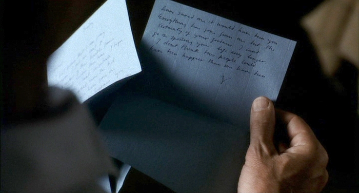
For Stephen Daldry’s The Hours, I was once sent from London on a day trip to the University of Sussex’s archive in Brighton, with the sole purpose of photographing Virginia Woolf’s original letters, so they could be accurately reproduced for the film, using period-accurate fountain pens, ink and paper.
No such dedication seems to exist in a lot of recent shows, where periods seem to blend, 50s electric wall clocks have no cords, and Victorian newspapers feature inkjet-printed photos. I am not talking about small, no-budget productions here. Even big, expensive shows like Amazon’s recent adaptation of Picnic at Hanging Rock seem to take liberties with period styling, mixing fashion and architectural styles and infusing the visuals with modern touches, producing results that in some cases resemble pastiche. It is not always the art department’s fault. More often than not, these are “strategic” choices of the director and the producers, in an effort to repackage the show for a modern audience. The art department is just following instructions.
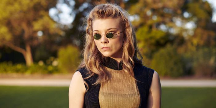
What is even more irritating, is that even respectable film and TV critics don’t seem to notice this lapse in historical accuracy. The Guardian’s Peter Bradshaw hailed Call Me By Your Name as a “ravishingly beautiful film”. I guess any film shot in the summertime Italian countryside and starring handsome actors can be called “ravishingly beautiful”, but I’m afraid the recreation of early 80s Italy is questionable. Shirts are too baggy, shorts are too long, every motorbike is a shiny Vespa, the family seems to own the entire back catalogue of Lacoste polo shirts, and so on. It looks more like a fashion editorial, than an attempt to recreate a period. And don’t even get me started on props. I still can’t get over the shiny, modern Illy coffee tins.

Of course, this is not a new problem. And sure, there are still examples out there of films and film-makers who respect historical accuracy — check Tom Ford’s A Single Man if you want to get a dose of impeccable 50s styling. I just feel that in the age of Netflix and Amazon Video, the examples are few and far between.
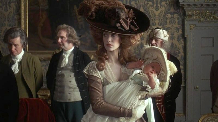
This might sound like a rant about things that are really not that important, but I feel that Antony Minghella was right. As professionals charged with the task of recreating past periods, we do have a duty to get things right — or at least as right as possible. Otherwise, we are at risk of producing work that is homogenised, and with no contextual bearing in reality. And when we get things right, it does make a difference. Look at Barry Lyndon, and the amazing set and costume work that looks like it jumped out of a Constable landscape or a Gainsborough social scene. In 50 years from now, every film school in the world will still hold it as the golden standard of period styling. Who is going to remember Amazon’s adaptation of Picnic at Hanging Rock?

You have made so many great points here Stelios! Sometimes it is deliberate pastiche – playfully re-imagining historical periods for knowing contemporary audience – Marie Antoinette or Casanova. Here designers playing with the past to entertain the present run the risk that future generations of viewers might think they don’t know their history. I am with you and Minghella – historical accuracy in production deesign and costume really matters. You have to know the rules before you can start to play around with them, otherwise it’s just lazy inaccuracy and ignorance – ‘It’s Medieval with a Steam Punk Twist’ aaargh!
LikeLike
Thanks for your comment Emma! Absolutely true, I’ve got nothing against deliberate pastiche, especially when executed by masters who know the periods like the back of their hands. Marie Antoinette and Casanova are great examples of playful re-interpretations that feel organic and credible.
LikeLike
I think you will might enjoy Hannah Greig’s interesting comments about her work on Poldark on the importance of historical accuracy and the challenges posed by texts SET in the past – the problem of the back-fastening dress …
https://www.bbc.co.uk/news/uk-england-cornwall-37246411
LikeLike
Excellent.
LikeLike
Thank you Greg.
LikeLike