Carlo Simi: Framing the Action

Picture-202.png

You may or may not be a fan of Sergio Leone’s spaghetti westerns, but there is no escaping the fact that they have an enduring influence; Quentin Tarantino, George Lucas and Martin Scorsese are self-confessed fans, and Clint Eastwood dedicated his Oscar for Unforgiven to Leone. I grew up with spaghetti westerns — there was a time in the ’80s that they were a staple on Greek television, and not just Leone’s well-known ones, but also obscure ones by Sergio Corbucci, Enzo Barboni and others. Some of these were real gems — I still think Corbucci’s The Great Silence is one of the best revisionist westerns to come from either side of the Atlantic. The main reason I liked spaghetti westerns was the iconography: the low-angle shots of larger-than-life characters, the stylised action and the comic-book sensibility that was so different from anything coming from the United States. They were also great fun to watch.

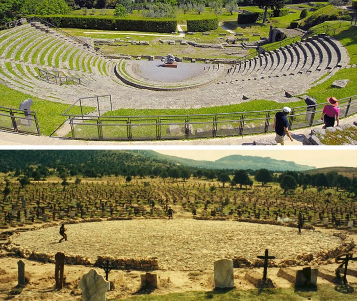
Instrumental in the creation of that iconography was the work of production designer Carlo Simi, Leone’s collaborator and designer of films like For a Fistful of Dollars, Once Upon a Time in the West and The Good, the Bad and the Ugly. Looking at Leone’s films again, one can identify the visual devices and the carefully structured staging that Simi and Leone used to establish this highly stylised world. One of these visual devices was the way they used the architecture, the locations and the landscape to frame the action. A good example is the famous shootout in Sad Hill, the cemetery in The Good, the Bad, and the Ugly. Setting this climactic scene within the big circular centre of the cemetery elevates the characters from mere combatants to high-drama actors on stage in an ancient tragedy. This action framing is found everywhere in Simi’s work; every whitewash archway, every telegraph pole or wooden fence frames or complements a dramatic moment.

comparison.jpg
Above: Ancient Roman Amphitheatre in Fiesole, Italy. Below: Sad Hill cemetery.

Highly stylised staging can be risky in cinema. In the hands of a less talented director, actors can become parodies of themselves, and in the hands of a less talented designer, stylised settings can lose their grounding in reality. Leone and Simi were clever enough to infuse their stylised settings with a great deal of historically accurate detail, thus making them believable. The Spanish location builds, like the famous town of ‘El Paso’ built in the desert of Tabernas in Almeria, look more real than the real thing. They easily compare with or surpass the detail in the best films of Ford or Peckinpah. But Simi did not just create the sets. He also designed the costumes, and is credited with the creation of the iconic poncho-caped look of Eastwood’s “man with no name” character.

A testament to Simi’s influence is how much his costume and set designs have been imitated throughout the years, not just in westerns, but also in commercials, music videos and indeed in the work of postmodernist directors like Tarantino. Carlo Simi’s work in realising Sergio Leone’s vision of the Wild West illustrates perfectly how a production designer’s influence can occasionally define and characterise an entire genre, but also reach beyond that.

For more information about Carlo Simi, check out a Facebook page dedicated to his life and work here.

simi leone.jpg
Carlo Simi (left) with Sergio Leone (right)


The Beauty of the Landscape

ca2bybc

Of all Miyazaki’s films, The Wind Rises is the one that resonates with me the most. The main character’s inexorable quest for beauty is something that all slightly obsessive, creative types can relate to. There’s a scene in The Wind Rises where the protagonist, WWII aircraft designer Jiro Horikoshi and his colleagues are having lunch. Jiro stops eating to admire the beautiful curves of a bone of mackerel, only to be dismissed as a daydreamer. It is an excellent scene that summarises Jiro’s character in just a few seconds. In a beautifully self-referential way, it also illustrates Miyazaki’s (and Studio Ghibli’s) fascination with the natural beauty of this world hidden in every little detail of our physical environment.

Miyazaki’s environmentalism is well documented. His obsession with all things natural is well known, and his criticism of modern life’s effects on the environment (as well as on the individual) is manifested in some way in all of his films. But nothing illustrates better his love of the natural world than the exquisite background art of his films. Celebrated in full glorious detail in sweeping tracking shots, wide-angle vistas and intricate close-ups, the splendour and vibrancy of the backgrounds is as much part of the storytelling as Miyazaki’s characters themselves. Art directors like Nizou Yamamoto, Yoji Takeshige and the great master Kazuo Oga lead a Studio Ghibli art department loaded with talent. Guided by Miyazaki, they have forged the Ghibli aesthetic through years of painstaking attention to detail. In the process, they have also (perhaps unknowingly) forged a new appreciation of the sacredness of nature, and the urgent need for its preservation among their audiences.

“I should paint my own places best”, English landscape painter John Constable famously wrote to his friend John Fisher in 1821, adding that “painting is but another word for feeling”. Just as Constable drew inspiration from his beloved Dedham Vale in Essex, Kazuo Oga and his colleagues draw inspiration from regions of their native Japan to create a heightened sensibility of landscape, and help us develop a deeper appreciation of the world around us.


As close to the first time as it gets

ΕΤΟΥΑΛ 31052008 b

I got into film making because of Star Wars. In the summer of 1982, at the age of 10, I walked over a kilometre on my own to my local cinema to watch – alone ­­– The Empire Strikes Back (amazing that there was a time when a 10-year-old was allowed this in Kallithea, one of the busiest suburbs of Athens). I remember the cinema’s name was Etoile (Star in French) which, in hindsight, adds an extra layer of magic to my memories. I remember the lights going down, John Williams’ score booming through the stereo speakers and then … well, an experience like nothing I had ever felt before. When the lights went on again, I emerged from the cinema awestruck, floating above the pavements of Athens like a mesmerised X-wing pilot. It was a life-changing event, and needless to say, I was hooked. Hooked on Star Wars, and hooked on cinema.

When the prequels came out, like a lot of Star Wars fans of my generation, I found the weak characters and video-game aesthetics extremely lacking. I thought Lucas had not treated his own franchise, and the fans’ expectations, with respect. And like a lot of Star Wars fans, I greeted the news of a new Star Wars film with a mixture of excitement and trepidation. The snippets of information emerging from the film’s production were encouraging: the original characters were back, practical effects were replacing the CGI onslaught, real three-dimensional sets had been built, etc. When J. J. Abrams’ The Force Awakens finally came out, I was more than pleasantly surprised.  Despite my cynicism, acquired over 34 years of watching and studying film, I felt this was a worthy successor to the film I had watched back in 1982.

I have to say that I was not a fan of J. J. Abrams work before The Force Awakens, mainly because I had moved on from fantasy TV series and action-adventure genres. But I thought The Force Awakens was the work of a very clever director. He made a film catering to both new and old fans, with a dose of nostalgia and with new vibrant characters to advance the franchise. OK, the plot wasn’t terribly original, but Abrams made a shrewd decision to build on the old universe rather than replace it. He also realised that the main theme of the first trilogy was loyalty – loyalty to family, to a cause, to one’s beliefs. With Finn, Abrams introduces a protagonist whose awakening and launch to the limelight arises from an inner conflict: between loyalty to his masters and loyalty to his own values — a reflection of Luke Skywalker’s predicament in the first trilogy. Rey has all the charm and focus of Princess Leia, and she carries the baton of dynamic female characters with remarkable ease.

Star-Destroyer

Apart from the very clever work on the characters, there was some outstanding work in the design department. Star Wars, for the first time since Return of the Jedi in 1983, looks and feels familiar. Rick Carter, Darren Gilford and their art department have studied carefully the original Ralph McQuarrie designs: the new planets, vehicles, interiors and characters look like they belong to the same familiar universe. All the real-world references to existing or historic structures and objects (which contributed to the success of the original Star Wars) are there. I love for example how the triangular shape of a Star Destroyer crashed in the desert of Jakku resembles the pyramids in Egypt. The fact that a lot of the sets are built with real three-dimensional materials, aged and weathered, instead of being a sum of pixels on a computer screen, adds the realism that even sci-fi needs, to properly come to life.

Watching The Force Awakens made me feel a bit like a child again. That’s its biggest accomplishment, at least for a 45-year-old fan. Of course, as with all things in life, there is only one first time. They say that you can never repeat the excitement of your first kiss, the thrill of the first time you were given a pet, or the pleasure of the first time you read your favourite book, and this is definitely true for me and Star Wars. While the impact of the first time I watched The Empire Strikes Back can never be repeated, The Force Awakens is as close to the first time as it gets.

Mirrors, Tulips and Kokoschka

dam-images-resources-2012-01-carnage-sets-carnage-movie-sets-03

Roman Polanski’s Carnage was on TV a couple of nights ago, and I finally got to watch it (watching films on BBC HD is a real treat for detail-obsessed film buffs by the way -the broadcast quality is superb).

The reason I have wanted to watch this film since it came out 5 years ago is because it was designed by one of my heroes: Dean Tavoularis. I was intrigued to find out what the man who designed The Godfather and Apocalypse Now could do with a film that takes place entirely in a New York apartment. What imposing design feature, what grand colour scheme, what epic location build could a designer, even as talented and distinguished as Tavoularis, fit in one set? Would the set bear the signature of Tavoularis’ greatness or would it resemble the work of an ordinary, unexceptional designer?

Due to the setting –a middle class apartment in Brooklyn where two couples tear each other apart verbally after their kids have a fight – there are obvious parallels with films like Who’s Afraid of Virginia Woolf? and with Hitchcock’s Rope, both shot entirely in one set. The former even earned an Oscar for Production Design, but this was in an earlier era, when awards were not reserved for mega-budget, effects-driven films. Carnage is much funnier than these other films (the hilarious scene where Kate Winslet’s character vomits on a rare Kokoschka art catalogue is also ironic, since Kokoschka started his career by painting scenes with children) but boasts equally brilliant performances.

Tavoularis’ design is as personal as in any film he has ever worked on. Observant viewers will spot the carefully selected props, accurate and character-personalized to the smallest detail. The Africa-influenced art and tribal objects reflect Jodie Fosters’ character’s obsession with the continent, while the oversized table lamps point to her work (and class) aspirations. The carefully placed mirrors (look for the one ingeniously placed at an angle directly opposite the front door) are a small reminder of Tavoularis’ ability to use objects as metaphors. And then there are the tulips – one cannot help but make the connection with the oranges in The Godfather trilogy.

Built in the studios of Bry, 10 kilometres outside Paris, this great little set is as New York and as “Tavoularis” as can be. And Carnage is a little gem of a film I highly recommend.

The symbolism of rocks

l avventura

I am a big fan of Antonioni but watching L’Avventura left me with mixed feelings. There are scenes of profound sincerity and poignancy. There are also scenes of awkward, mundane action – which is one of Antonioni’s hallmarks and works perfectly in films like La Notte, but here I just do not feel it serves any purpose. There is also some clumsy acting – Monica Vitti as the devoted but gullible Claudia is as radiant as ever, but occasionally she is out of her depth. Gabriele Ferzetti, as the handsome and capricious Sandro, is experienced and confident, but seems miscast – I can’t help but wonder what Marcello Mastroianni could have done with this role.

Whatever the shortfalls, this is a film of breathtaking beauty. The choice of locations is impeccable, and architecture is as important as in all of Antonioni’s films. Sandro (a failed architect) even has a brief monologue where he marvels at the beauty of Italian renaissance architecture and laments its demise. He concludes: “Who needs beautiful things anymore?”; in reality, he is citing modernism and mass production as an excuse for his own failings. Piero Poletto, Antonioni’s regular production designer, creates lavish interiors for the functions of the film’s privileged socialites, and juxtaposes them with harsh, unforgiving natural landscapes. The rocks of the Aeolian islets where Anna disappears is where the existential adventure begins. Poletto’s work on this film might not be as impressive as the hand-painted locations of Red Desert, but is equally evocative and perhaps even more functional on a symbolic level; the stark contrast of the settings perfectly illustrates and amplifies the emotional conflicts of the film’s characters.

For me, this is the kind of film that the term “flawed masterpiece” was coined for. But regardless of its strengths and weaknesses, it was great to watch another film from a director who does not feel the need (or the producer’s pressure) to explain what happens in the end. In a time of easy solutions and happy endings, it was a refreshing experience.