William Cameron Menzies in the art department of Gone With The Wind (1939)
It is hard to overestimate the influence of Gone with the Wind in production design. After all, the term “production designer” was coined for William Cameron Menzies, the designer of this film. Through three directors, three cinematographers, almost one year of shooting and dozens of sets built on soundstages and backlots, Menzies created lavish ballrooms, bloody battlefields, and the great fire of Atlanta in gloriously horrific detail, burning down real sets (albeit revamped obsolete sets from King Kong). Above all, Menzies held the whole project together, both in practical and visual terms, through the constant production battles raging in the background.
Therefore, when decorating our brand-new studios in the university where I teach production design, it seemed appropriate that one of the posters should be of Gone with the Wind. I was never comfortable with the portrayal of black people in the film. But I always saw it within the context of its time; it was made at a time when segregation was still part of everyday life in the US, and was set in an era of endemic racism. I also naively thought it was just an archetypal “love in the midst of war” story that wasn’t as sickeningly racist as, say, Birth of a Nation, or the blackface minstrel musicals of the twenties and thirties.
Coming down: the poster of Gone With The Wind (1939)
I realise now that I was wrong. I was looking at Gone with the Wind through the wrong lens. Being white middle class, I could not see it the way a black viewer could. And perhaps I was all too eager to push the issues of race under the carpet, so I could focus on the “big picture” and celebrate the brilliance of Menzies. But there are more important issues at play here. That’s why the poster is coming down from our wall as soon as we return from summer break.
Tackling the issue of representation of black people in our industry is not as simple as taking down a poster, or removingGone with the Wind from streaming platforms, though. It is a complex and multifaceted issue, including the representation of black and ethnic minority people in films, the roles they are given as actors and the lack thereof. There is also the shameful lack of BAME people in film crews and art departments, especially in the UK. Steve McQueen, director of 12 Years a Slave, was absolutely right to be furious about this in his recent Guardian article.
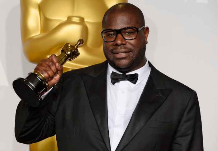
Steve McQueen with his Oscar for best film for 12 Years a Slave.
Steve McQueen says in his article that there should be more apprenticeships for black people within the industry. I agree. At university, we genuinely try to recruit more students of BAME background, but we are failing. If you look at the statistics, of the 146.000 students studying in creative arts and design in the UK (2018/19), only about 24.000 were from a BAME background. I have a feeling that in film-related subjects, the difference is even wider. I looked at the offers made to applicants in my university in the same year: 76% to white students compared to 70% to BAME students. This shows that although there’s work to be done in this regard, the number of offers does not justify the huge disparity. There are obviously wider social and financial reasons for it, and a deep class divide that prevents young black people from even considering a career in creative arts and design. This is something that requires deep interventions within society, and at a very early stage in our education system. Universities or film and TV production companies cannot do this alone. It can only be done at government level – providing, of course, there is a government willing to prioritise this issue.
Hannah Beachler, the first black production designer to win an Oscar.
It took 80 years after Menzies received his production design title for the first black production designer to win an Oscar in 2019. Hopefully, someday soon there will be a government willing to put their hands deep in their pockets and address the inequalities in our society that prevent black people from finding their way into films and the crews that make them. Until then, what we can do is nurture and promote black talent wherever we can, and of course, vote the right people in. And take down those posters.
The 2010s have been a good decade for production design. Oscar nominations, that antiquated way to measure the quality of our profession’s yearly output, mostly got it right in this category, albeit in predictably Western-biased fashion; there were, as always, some notable omissions from international films.
Trying to make sense of trends and themes in recent filmography is tricky, but I believe in the 2010s we saw a welcome return of the big budget period film, and an overall preoccupation with more “recent” periods – mainly the 1970s and 80s. It’s also marked the rise, and complete domination of streaming as a way to watch films and TV shows.
To de-age or not to de-age? The Irishman (2019, dir. Martin Scorcese)
As the decade ends, everybody is wondering if streaming platforms will be the saviour or executioner of cinema. And technology is pushing the boundaries in terms of what is possible and acceptable in actor de-ageing and even the “resurrection” of late film stars. This all means that our industry enters new, uncharted waters, and new exciting or perhaps challenging times, depending on which way you look at things.
There are a lot of cinematic “best of the decade” lists around at the moment, but not many “best production designs of the decade” lists. So, here goes my list of 10 best production designs of the 2010s.
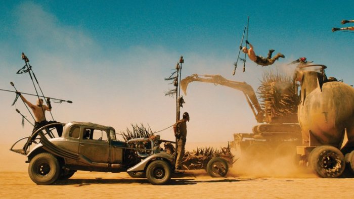
10. Mad Max: Fury Road (2015, Production Designer Colin Gibson)
As you can tell by reading the rest of this list, I don’t usually do fantasy (probably watched too much in my younger years) but Mad Max: Fury Road is just so mind-bogglingly impressive! The tremendous number (and size) of bespoke vehicles, the epic scale of the chases, the inventiveness of the hardware just forced me to include it. It won the 2015 Oscar for production design, and although I personally would have given the statuette to The Revenant (further down in this list), Fury Road is a worthy contender.
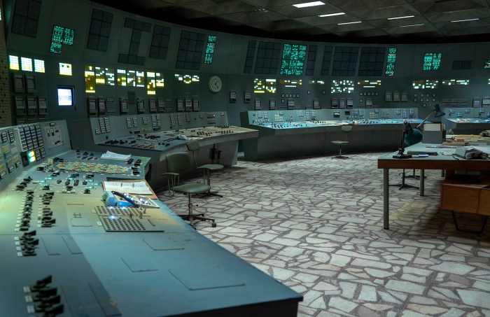
9. Chernobyl (2019, Production Designer Luke Hull)
This HBO-produced limited series had to be included here for the sheer scale and cinematic scope of the production design, but also the historical accuracy with which the events are portrayed. The subject is difficult – the worst nuclear accident in the history of mankind, and the challenge of recreating the Chernobyl nuclear plant and the town of Pripyat was enormous. Luke Hull and his team did a stunning job, working with a patchwork of East-European locations and soundstage builds that merge seamlessly. A thoroughly deserved Primetime Emmy for Hull, and a milestone in historical drama – if you haven’t seen it, do it. Tonight.
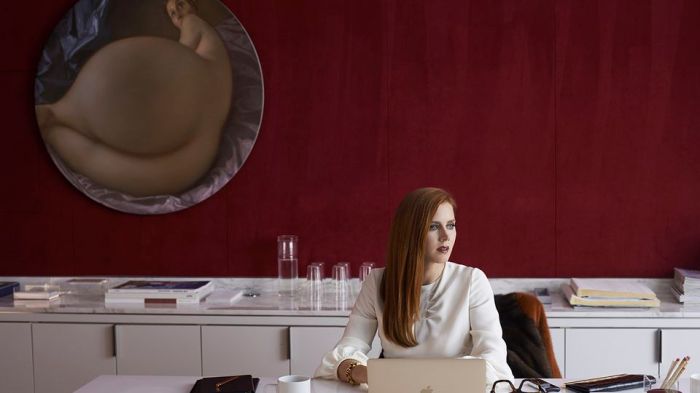
8. Nocturnal Animals (2016, Production Designer: Shane Valentino)
Tom Ford has (to date) made only 2 films – and they both look fantastic! Nocturnal Animals, his second feature, has a European air to it, which is no surprise as both Ford and production designer Shane Valentino, reportedly looked at Antonioni’s Red Dessert and Bertolucci’s The Conformist as inspiration for the film’s settings. It also helps that Ford has a huge art collection and is friends with some of the most well-known contemporary artists; so when the walls of the main character –an art gallery owner- had to be filled with contemporary art, all it took was a phone call to get the real article! In every respect, one of the most stylish films of the decade.
7. Birdman (2014, Production Designer: Kevin Thompson)
I am a big fan of cerebral, high concept films and Birdman is one of the very few to come out of Hollywood in recent years (it’s the second Alejandro Inarritu film in this list – probably not a coincidence). Kevin Thompson built the entire labyrinthine backstage of Broadway’s St. James Theatre on the soundstage, complete with movable walls and ceilings so the set can slowly and subtly get smaller and more claustrophobic as the main character’s mental state deteriorates. The film was designed to look like one long take, and the Steadicam shots from soundstage to location are absolutely seamless. Oh and I love the Kubrick/The Shinning reference in the carpets.
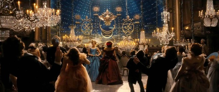
6. Anna Karenina (2012, Production Designer: Sarah Greenwood)
In Anna Karenina, director Joe Wright and production designer Sarah Greenwood pulled off an amazing narrative and visual feat; to tell a story set in 19th-century St. Petersburg as if it was filmed entirely in a run-down theatre. Anna Karenina’s scope is by no means diminished by the venue; some of the sets include a train station with a full size, moving steam engine, a skating ring and a horse racing track. It also features some of the best transitions I’ve seen for a long time, using theatrical optical illusions, trompe-l’œil and creative lighting. This is fearless film-making on a grand scale. We need more films like that.
5. Tinker Tailor Soldier Spy (2011, Production Designer: Maria Djurkovic)
Maria Djurkovic was nominated for an Oscar in 2014 for Imitation Game, a beautifully designed recreation of the 1940s story behind the Enigma machine. However this adaptation of a John le Carré cold war spy novel is my favourite, as it treads the line between period-accuracy and creativity with admirable confidence. It is full of beautifully observed period details and Ken Adam-esque, creative touches: sound-proofed conference pods? Check. A monolithic, brutalist MI6 hidden within a Victorian complex? Check. Labyrinthine archive libraries? Check. Hoyte van Hoytema’s camera “hides” big parts of the sets in the shadows of a monochrome twilight – a brave decision that amplifies the film’s sense of mystery. Spy movies have rarely looked better than this.
4. The Revenant (2015, Production Designer: Jack Fisk)
Jack Fisk’s pedigree of collaborations is impressive; David Lynch, Terrence Malick, Paul Thomas Anderson, I mean the guy has worked with some of the greatest auteurs of the modern era, and his designs always hit the nail on the head in terms of the emotional and narrative tone of the film. But The Revenant is something else – the flow of Inarritu’s camera through the 1820s South-Central Dakota landscape is relentless, and every manmade structure we meet along the way looks so naturally integrated, it sets new standards for “organic” design in natural settings. Fisk used only locally sourced materials for a uniform colour palette, and even invented a technique to stand trees by pouring water in the tree’s base to freeze. Production design as an immersive experience – courtesy of Jack Fisk.
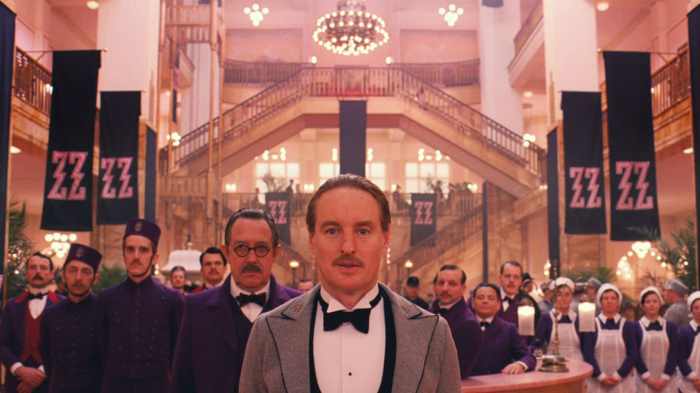
3. Grand Budapest Hotel (2014, Production Designer: Adam Stockhausen)
Wes Andersons’ films always look great, but the charm of Grand Budapest Hotel by far surpasses all his previous efforts. Andersons’ one-point perspective compositions look like period, photochrom postcards. Annie Atkins’s graphics further accentuate the 2D illustrative look. But the real achievement here is the way the hotel becomes a character that changes right in front of our eyes, ageing as the decades past, shedding its youthful Art Nouveau skin to reveal layers of soviet brutalism. A true delight of colour, texture and patterns, as tasty as a carefully boxed cake from Mendl’s.
2. Hard to be a God (2013, Production Designers: Sergey Kokovkin, Georgiy Kropachyov, Elena Zhukova)
If IMDb’s listed budget of 7 million dollars is even close to the truth, it is hard to think of any other film in recent history that achieves so much with such a tiny budget. Aleksey German’s sci-fi epic from Russia, took 13 years to complete, and its production was apparently fraught with problems (this is perhaps why there is not one, but three designers credited) but the production design is absolutely stellar. At times nauseating, at times exhilarating, it is a mix of mud, rotting hardware, flesh and blood, set against a medieval landscape of perpetual disintegration. It feels like watching a live, black and white version of a Hieronymus Bosch painting – on steroids. Terrific stuff.
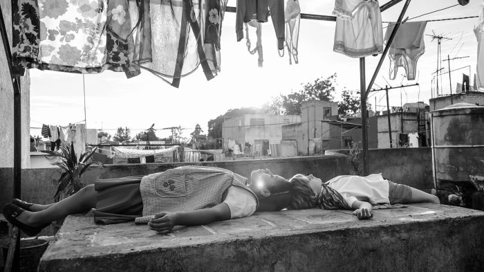
1. Roma (2018, Production Designer: Eugenio Caballero)
“All the world’s a stage…” Roma (dir. Alfonso Cuarón 2018)
Eugenio Caballero’s work in Roma shines through tiny, period-perfect details and immaculately dressed, huge urban vistas of 1970s Mexico City. The wide-angle lens of Cuarón’s camera captures every detail with glorious clarity and the nuances of the design (the garage that is too small for the estranged father’s car, the washing line forming a theatrical proscenium over the two protagonists on the rooftop) are a joy to behold. Caballero and Cuarón grew up in the Mexico City suburb of Roma, so this was obviously a labour of love for both director and production designer. Their work resonates with me in a special way as this is the decade I grew up in (in a similarly vibrant suburb of Athens) and remember quite well. This is production design with vision and empathy – and my highlight of the decade.
Honorary Mentions:
Cold War (2018, Production Designers: Marcel Slawinski, Katarzyna Sobanska-Strzalkowska)
One of the most beautiful films of the last few years. Europe and the cultural and political upheaval of the 1950s and 60s have never looked so sensual.
Phantom Thread (2017, Production Designer: Mark Tildesley) This deservedly won the Oscar for best costumes, but Tildesley’s sparse, razor-sharp interiors deserved at least a nomination.
Twin Peaks: The Return, Episode 8 (2017, Production Designer: Ruth De Jong)
The episode that features a huge teapot-shaped object with the voice of David Bowie. Any designer who can turn a brief like this into a stunning visual, deserves our respect.
David Bowie as a tea kettle. Twin Peaks: the Return (dir. David Lynch, 2017)
A favourite scene from Philip Kauffman’s The Unbearable Lightness of Being came up on my YouTube feed the other day. So I clicked play and watched Thomas tell his lover Sabina that “her hat is the detail that makes her totally different from all other women”. Sabina then explains how this bowler hat is very, very old because it belonged to her great, great grandfather. At that point, my mind drifted to something completely different. I thought: “This hat looks way too new. Surely it cannot be a hundred years old.”
Therein lies the curse of the designer obsessed with period-accurate detail. Being able to freely revisit scenes from your favourite films on YouTube means that you get to discover previously unnoticed flaws (in this case, a minor flaw — it was the right hat; it maybe needed a bit of ageing down).
The Unbearable Lightness of Being (1988). The bowler hat.
In my career, I have been lucky to have worked with designers and directors who took historical accuracy seriously. I can still remember the late Antony Minghella visiting the props department of Cold Mountain, in our offices in an abandoned office block just outside Prague, to check the hand-sewn Confederate and Union military flags we had made locally. He said to us: “We have a duty to all the people that died in the battle of Petersburg to get these right”.
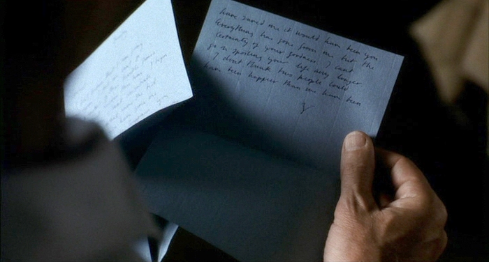
For Stephen Daldry’sThe Hours, I was once sent from London on a day trip to the University of Sussex’s archive in Brighton, with the sole purpose of photographing Virginia Woolf’s original letters, so they could be accurately reproduced for the film, using period-accurate fountain pens, ink and paper.
The Hours (2002). Virginia Woolf’s letter.
No such dedication seems to exist in a lot of recent shows, where periods seem to blend, 50s electric wall clocks have no cords, and Victorian newspapers feature inkjet-printed photos. I am not talking about small, no-budget productions here. Even big, expensive shows like Amazon’s recent adaptation of Picnic at Hanging Rock seem to take liberties with period styling, mixing fashion and architectural styles and infusing the visuals with modern touches, producing results that in some cases resemble pastiche. It is not always the art department’s fault. More often than not, these are “strategic” choices of the director and the producers, in an effort to repackage the show for a modern audience. The art department is just following instructions.
Sleeveless Victorian frock? Tinted specs? Early 1900s Australia looks very Lagerfeld. Picnic at Hanging Rock (2018)
What is even more irritating, is that even respectable film and TV critics don’t seem to notice this lapse in historical accuracy. The Guardian’s Peter Bradshaw hailed Call Me By Your Name as a “ravishingly beautiful film”. I guess any film shot in the summertime Italian countryside and starring handsome actors can be called “ravishingly beautiful”, but I’m afraid the recreation of early 80s Italy is questionable. Shirts are too baggy, shorts are too long, every motorbike is a shiny Vespa, the family seems to own the entire back catalogue of Lacoste polo shirts, and so on. It looks more like a fashion editorial, than an attempt to recreate a period. And don’t even get me started on props. I still can’t get over the shiny, modern Illy coffee tins.
Call Me By Your Name (2017). Shinny modern Illy coffee tins in 80s Italy.Timeline of Illy coffee tin designs.
Of course, this is not a new problem. And sure, there are still examples out there of films and film-makers who respect historical accuracy — check Tom Ford’s A Single Man if you want to get a dose of impeccable 50s styling. I just feel that in the age of Netflix and Amazon Video, the examples are few and far between.
This might sound like a rant about things that are really not that important, but I feel that Antony Minghella was right. As professionals charged with the task of recreating past periods, we do have a duty to get things right — or at least as right as possible. Otherwise, we are at risk of producing work that is homogenised, and with no contextual bearing in reality. And when we get things right, it does make a difference. Look at Barry Lyndon, and the amazing set and costume work that looks like it jumped out of a Constable landscape or a Gainsborough social scene. In 50 years from now, every film school in the world will still hold it as the golden standard of period styling. Who is going to remember Amazon’s adaptation of Picnic at Hanging Rock?
Barry Lyndon (1974) Period styling, done properly.
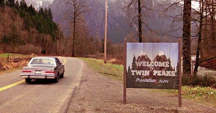
Three years ago, I signed a petition to save Twin Peaks. Showtime had just announced that due to contract differences with David Lynch, it would not go ahead with plans to produce the long-awaited third season of the cult TV series. I was a huge fan, and I felt compelled to help out in any way I could. After all, this was the show that had opened my mind to the limitless potential of television, all those years back.
Yesterday, I watched the final episode of the new, third season of Twin Peaks, that my signature (along with 30000 others) helped to get off the ground. It was episode number 18, and watching the final credits roll felt like crossing the finish line of a long, mental marathon. It was an awkward experience, punishing and rewarding at the same time (more punishing than rewarding, actually), wrapped up in a bleak finale. People I know, fans of the first and second season, just like me, gave up long before episode 18 — they just couldn’t invest the time and effort to watch what seemed like an exercise in self-indulgence. I can’t blame them, because many times I felt the same.
There are fans out there who loved it — I occasionally visit the forums, and have come across Lynch die-hards analysing the episodes with admiration — but there is a general numbness in most people’s reaction; with the exception of a few moments of Lynchian brilliance (see episode 8), this was not the Twin Peaks we had loved and missed all these years. One can go on analysing what’s missing this time round, but I feel it can be summarised thus: save for a fleeting glimpse in the penultimate episode, the famous ‘Welcome to Twin Peaks’ sign was nowhere to be seen.
Alphaville. Dir. Jean Luc Godard (1965)
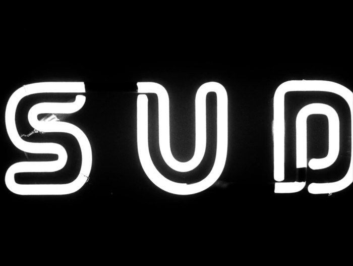
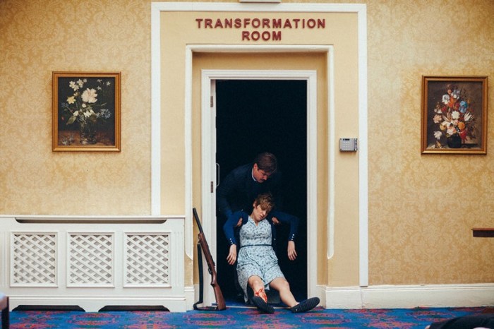
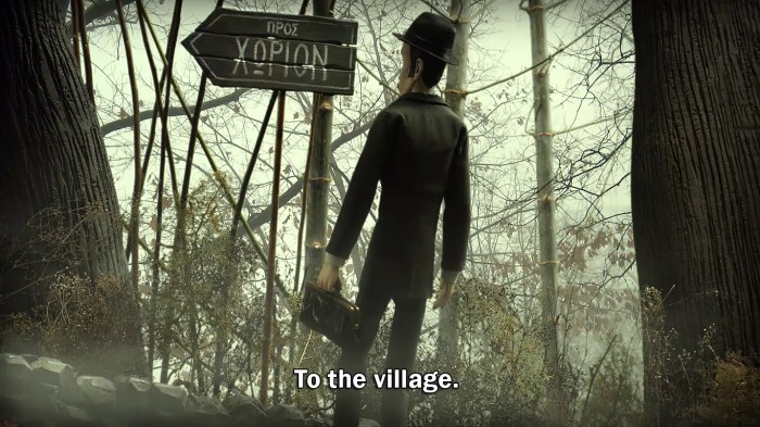
I discovered the use (and power) of signs in film design, early in my art department career. I was fortunate to work with production designers who appreciated and used signs in their films, both as a narrative tool and to convey information. I have used them in my own films — in my short The Village, the main character restores the village’s sign to express his longing for communication. And I have admired how some directors use signs as a way to negotiate the limitations of a small budget. Look at Godard’s neon signs in Alphaville: a simple, neon-lit ‘Sud’ turns 1960s Paris into a sci-fi metropolis. Or Lanthimos’ clever and funny ‘transformation room’ sign in The Lobster. The act of humans transforming into animals, delivered, not by state-of-the-art special effects, but with a simple sign above a door.
The Lobster. Dir. Yorgos Lanthimos (2015)
So, it is only natural that I came to love the ‘Welcome to Twin Peaks’ sign. And I wasn’t alone. During and after the first season was broadcast, it was everywhere: in the show’s main titles, on the cover of the best-selling soundtrack, on the posters and much of the merchandise. Steven LaRose, the artist who painted it, claimed that he spent no more than a couple of hours making it; nevertheless, I think it was a masterpiece of American naïve art — at the same time welcoming, and evocative of the small-town dread that Lynch so masterfully used to weave his fable.
I think the absence of this sign epitomises the trouble with the new season: distant locations (including France!), aloof characters, and more time spent in the Red Room than in all the town’s locations put together. Twin Peaks the show is not about the town of Twin Peaks, any more.
Perhaps that was the whole point. The TV landscape in the era of internet streaming is too vast to be preoccupied with a small American town in the Pacific Northwest. And, granted, there is still no other TV show that comes even close to this show’s audacity and willingness to challenge the conventions of televised entertainment. I just wish there was more of the charm and humanity of the original. And more of the sign that read: ‘Welcome to Twin Peaks, Population 50,201’.
Honesty is a rare quality in films these days. But every once in a while, a film comes along that presents an honest view of the world, a pure slice of reality, without trying to manipulate the viewer’s feelings. Amour by Michael Haneke is one such film. The premise is quite simple: An elderly, cultured, middle class couple live their life quietly, doing the things they enjoy: attending piano concerts, reading, listening to music. Then one day, the woman suffers a mild stroke. And then another. Her condition gradually deteriorates. Her husband is left to care for her and witness the transformation of his beloved partner from an intelligent human being to a vegetable.
While it is sometimes uncomfortable to watch, it is ultimately a profoundly moving film. Its emotional impact starts with the casting; the mere fact that 2 giants of French cinema like Emmanuelle Riva and Jean-Louis Trintignant, have in their 80s agreed to be a part of this undignified journey of physical disintegration, is by itself quite touching. Actors, even octogenarians, tend to be image-conscious, and it is hard to imagine any actor who would willingly tarnish their image this way in the twilight of their career. Their performances are among the finest I have ever seen in a film.
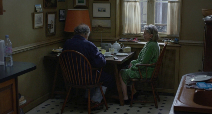
I could go on about the qualities of this film; the clear-headed, unbiased direction by Haneke, the restrained cinematography (by non-other than Darius Khondji of Seven and Panic Room), but what really stands out for me is the production design by Jean-Vincent Puzos. Set entirely in one apartment (with the exception of one scene at the beginning) it is a lesson in carefully personalised set dressing, thoughtful texturing and ageing of surfaces, and an ingenious layout that both drives and enhances the emotional journey of the characters.
Built entirely on a soundstage, this is a typical Parisian apartment with big windows and parquet flooring – which apparently was made from old wooden blocks to get the right creaking sound when actors walk on it. It features an unusually big hallway (adorned by a large Aubusson wall tapestry), which works as the nerve centre of the house; around it all the rooms are circularly laid out and the lives of the characters revolve. The size of this hallway gives the characters long walking distances between rooms, emphasising their increasing difficulty to move independently. It also provides stunning long shots through doors, sometimes looking at 2 rooms at the same time. Doors are a powerful symbol in the film, representing the stages of life and the passing from one stage to the next. It is no coincidence that in the final shot of the film, after the inevitable end, all the doors are open in the empty house for the first time, allowing the couple’s daughter to walk freely between rooms.
By contrast, we find that the rest of the rooms are modestly sized. The kitchen, which is where the elderly couple spend a lot of their time is a small, intimate space, just big enough to fit a small table and 2 chairs. It is in this small room that Anne has her first stroke. The tired Windsor chairs, the condensation-stained walls and greasy wall tiles, all echo a long life of companionship that is now coming to an end.
The rest of the rooms are equally evocative of the life the couple has lived; the study, with the baby grand piano, the wooden panelled walls and the record collection, is testament to their affiliation with music. The walls are lined with pictures and paintings. There is a sequence where Haneke shows us in full close up 6 different paintings hanging in different places around the house, all in the style of classic French landscape paintings of the mid-19th century. They are the only images of nature in the entire film, and they offer the audience a much needed respite after one of the most intense scenes of the film.
There is nothing flashy, or even impressive in the design of Amour. It is after all just an architectural space filled with a selection of props. The difference is that these mostly old things (with the exception of a modern CD player) look like they truly belong in this particular place. All things, bid and small, look like they have been slowly and lovingly collected throughout many years of coexistence, and represent a lifetime of experiences, tastes and feelings. They are personal belongings that signify everything that these people are, and everything that they are about to lose. I believe this to be the highest achievement of a production designer, to create a set that reflects the characters with no frills, no cheap sentimentality, with an honesty that ultimately shows life as it is; wonderful, tragic, real.
You may or may not be a fan of Sergio Leone’s spaghetti westerns, but there is no escaping the fact that they have an enduring influence; Quentin Tarantino, George Lucas and Martin Scorsese are self-confessed fans, and Clint Eastwood dedicated his Oscar for Unforgiven to Leone. I grew up with spaghetti westerns — there was a time in the ’80s that they were a staple on Greek television, and not just Leone’s well-known ones, but also obscure ones by Sergio Corbucci, Enzo Barboni and others. Some of these were real gems — I still think Corbucci’s The Great Silence is one of the best revisionist westerns to come from either side of the Atlantic. The main reason I liked spaghetti westerns was the iconography: the low-angle shots of larger-than-life characters, the stylised action and the comic-book sensibility that was so different from anything coming from the United States. They were also great fun to watch.
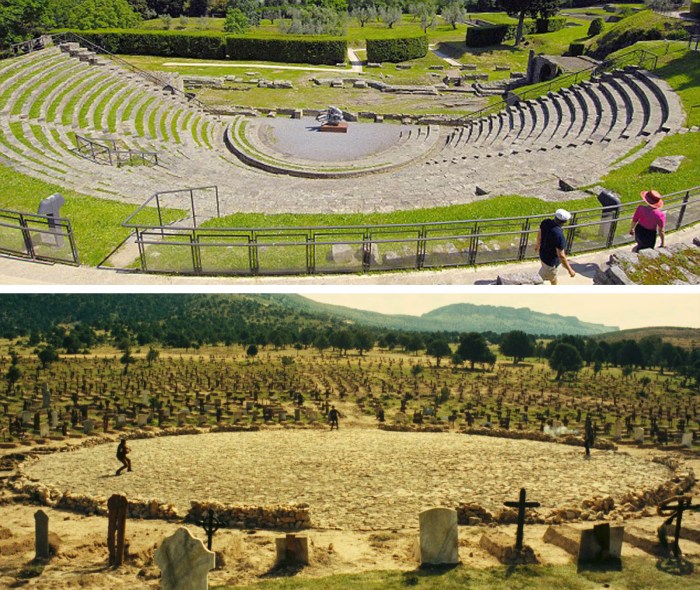
Instrumental in the creation of that iconography was the work of production designer Carlo Simi, Leone’s collaborator and designer of films like For a Fistful of Dollars, Once Upon a Time in the West and The Good, the Bad and the Ugly. Looking at Leone’s films again, one can identify the visual devices and the carefully structured staging that Simi and Leone used to establish this highly stylised world. One of these visual devices was the way they used the architecture, the locations and the landscape to frame the action. A good example is the famous shootout in Sad Hill, the cemetery in The Good, the Bad, and the Ugly. Setting this climactic scene within the big circular centre of the cemetery elevates the characters from mere combatants to high-drama actors on stage in an ancient tragedy. This action framing is found everywhere in Simi’s work; every whitewash archway, every telegraph pole or wooden fence frames or complements a dramatic moment.
Above: Ancient Roman Amphitheatre in Fiesole, Italy. Below: Sad Hill cemetery.
Highly stylised staging can be risky in cinema. In the hands of a less talented director, actors can become parodies of themselves, and in the hands of a less talented designer, stylised settings can lose their grounding in reality. Leone and Simi were clever enough to infuse their stylised settings with a great deal of historically accurate detail, thus making them believable. The Spanish location builds, like the famous town of ‘El Paso’ built in the desert of Tabernas in Almeria, look more real than the real thing. They easily compare with or surpass the detail in the best films of Ford or Peckinpah. But Simi did not just create the sets. He also designed the costumes, and is credited with the creation of the iconic poncho-caped look of Eastwood’s “man with no name” character.
A testament to Simi’s influence is how much his costume and set designs have been imitated throughout the years, not just in westerns, but also in commercials, music videos and indeed in the work of postmodernist directors like Tarantino. Carlo Simi’s work in realising Sergio Leone’s vision of the Wild West illustrates perfectly how a production designer’s influence can occasionally define and characterise an entire genre, but also reach beyond that.
For more information about Carlo Simi, check out a Facebook page dedicated to his life and work here.
Roman Polanski’sCarnage was on TV a couple of nights ago, and I finally got to watch it (watching films on BBC HD is a real treat for detail-obsessed film buffs by the way -the broadcast quality is superb).
The reason I have wanted to watch this film since it came out 5 years ago is because it was designed by one of my heroes: Dean Tavoularis. I was intrigued to find out what the man who designed The Godfather and Apocalypse Now could do with a film that takes place entirely in a New York apartment. What imposing design feature, what grand colour scheme, what epic location build could a designer, even as talented and distinguished as Tavoularis, fit in one set? Would the set bear the signature of Tavoularis’ greatness or would it resemble the work of an ordinary, unexceptional designer?
Due to the setting –a middle class apartment in Brooklyn where two couples tear each other apart verbally after their kids have a fight – there are obvious parallels with films like Who’s Afraid of Virginia Woolf? and with Hitchcock’s Rope, both shot entirely in one set. The former even earned an Oscar for Production Design, but this was in an earlier era, when awards were not reserved for mega-budget, effects-driven films. Carnage is much funnier than these other films (the hilarious scene where Kate Winslet’s character vomits on a rare Kokoschka art catalogue is also ironic, since Kokoschka started his career by painting scenes with children) but boasts equally brilliant performances.
Tavoularis’ design is as personal as in any film he has ever worked on. Observant viewers will spot the carefully selected props, accurate and character-personalized to the smallest detail. The Africa-influenced art and tribal objects reflect Jodie Fosters’ character’s obsession with the continent, while the oversized table lamps point to her work (and class) aspirations. The carefully placed mirrors (look for the one ingeniously placed at an angle directly opposite the front door) are a small reminder of Tavoularis’ ability to use objects as metaphors. And then there are the tulips – one cannot help but make the connection with the oranges in The Godfather trilogy.
Built in the studios of Bry, 10 kilometres outside Paris, this great little set is as New York and as “Tavoularis” as can be. And Carnage is a little gem of a film I highly recommend.