Featured

And the Production Design Oscar will not go to…

Set decorating in The Boxtrolls (2014)

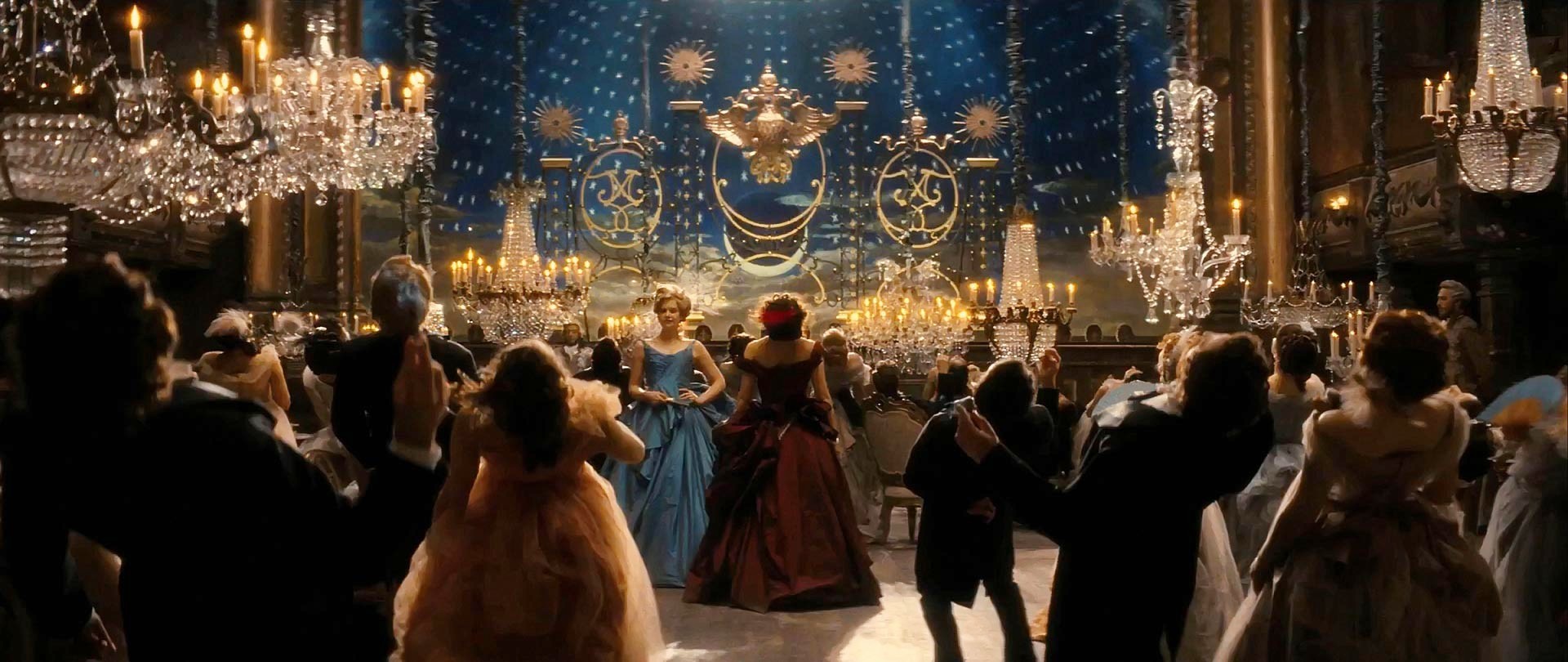
As the 2023 Oscars season grows closer, predictions for the Production Design category nominations are starting to crop up. The frontrunners are beautifully designed, big-budget productions like Elvis, Glass Onion, The Fabelmans and Avatar: The Way of Water. As to who will make the final cut, there are a few historical clues: it’s not very likely that any foreign language films will make it (sorry, All Quiet on the Western Front). Nor is it likely that any small, esoteric films like The Wonder or The Banshees of Inisherin will be in the mix, even if, in purely what-makes-good-production design terms, they deserve to be. Of course, every once in a while, a film from one of these unlikely places breaks the “glass ceiling” and gets nominated. There’s only one absolute, unquestionable certainty: animated features never make it into the final 5 of the Production Design Oscar nominations.

So why not animation? After all, this is the year of the beautifully designed Pinocchio, and the Academy’s rules are sufficiently vague to allow an animated film to be nominated for best Production Design. But this is not just a matter of Academy rules and regulations.

Guillermo del Toro in the set of Pinocchio (2022)

The Academy’s borderline contempt for animation could not have been better illustrated than in last year’s Oscars: before announcing the nominees for Best Animated Feature, the three presenters jokingly suggested that animated features are something only children watch on repeat and their long-suffering parents endure. There have been numerous stories of Academy members not watching all the nominated films in the animation category and voting based on their children’s preferences – which might explain why Disney has won 12 times over the last 14 years. Only 3 animation films have ever been nominated for the best picture Oscar. None of them won. In fact, with the exception of best song and best score (and some “special achievement” awards) no animated film has ever been nominated in any other Oscars category.*

Lily James, Halle Bailey, Naomi Scott, presenting the award for Best Animated Feature at the 2022 Oscars

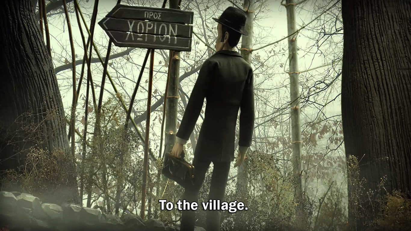
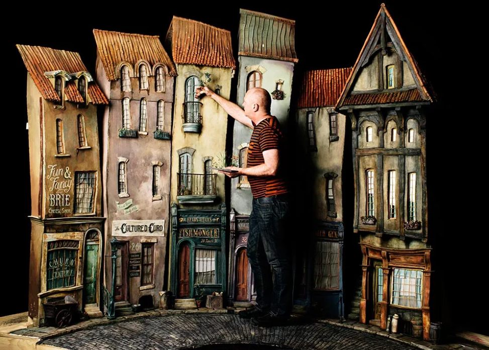
You would think that in the Academy’s narrow understanding of the field, at least one animation technique is “close enough” to live action to be considered for an Oscar: stop-motion animation. Stop-motion has physical, three-dimensional sets. Renowned production designers like Norman Garwood and Adam Stockhausen have designed stop-motion films. Stop-motion art departments are crewed with draftspeople, prop makers, set dressers, greenery and construction experts and all the other disciplines you would find in a live-action film art department. The difference is that the sets are smaller, but the task is more formidable: Everything, down to the smallest detail must be created from scratch. This of course is the same for all animation techniques: when legendary production designer Richard Sylbert visited the Pixar art department in 2001, he was thrilled to see the sheer amount of designing they were doing. He later said that if he and his mentor, William Cameron Menzies, were just starting out, they’d be working at Pixar!

Coraline’s beautiful Victorian mansion, complete with wraparound porch, turret and clapboard siding.

For me and for everyone who loves and follows both animation and production design, it’s a scandal that films like Coraline, Corpse Bride, The Boxtrolls or Aardman’s The Pirates! didn’t get at least a nod for an Oscar nomination in Production Design. Look at Coraline’s living and breathing garden scene set, or Aardman’s beautifully rendered galley in The Pirates! Look at the ingeniously stylized European city of Norvenia, or the fabulously steampunk underground lair in The Boxtrolls. I could go on about the fantastical, beautiful, visceral worlds created for stop-motion – not just those from recent history but also including old masters like Švankmajer and the Brothers Quay – but you get the picture.   

The Pirates! Band of Misfits (2012)

Guillermo del Toro made it clear in his recent Golden Globe speech, as did Wes Anderson and Tim Burton before him: animation is cinema. Pinocchio is the best proof of this, and it’s time for a long-delayed recognition of the craft of production design in stop-motion animation. It would be a perfect opportunity for the Academy to start redeeming itself for years of relegating animation to the second-league genre of “kid’s films”. Unfortunately, for all the reasons mentioned above, this is not going to happen. But Pinocchio totally deserves it, because it is a brilliantly designed film. Production designers Guy Davis and Curt Enderle have created a meticulously researched, spectacular vision of WWII Italy, with layer upon layer of history and texture applied to the settings, creating a world that spans magical mediaeval villages and nightmare fascist-training camps. More importantly, they created a world that complements the actors’ performances (so what if they are puppets?), and supports the grand themes of life, loss and belonging in del Toro’s tale. Isn’t this what the best Production Design is supposed to do?

Edit: The nominations are out and I’m thrilled to see All Quiet on the Western Front made it in the final 5. Predictably though, no Pinocchio.

*Who Framed Roger Rabbit was nominated for the Production Design Oscar in 1988, but it was technically considered live action rather than animation (according to the Academy, animation films must contain a minimum of 75% animated sequences).

The 2023 Oscar predictions are... well, predictable.

The Fall of Gone with the Wind (and of its poster)

william-cameron-menzies
William Cameron Menzies in the art department of Gone With The Wind (1939)

It is hard to overestimate the influence of Gone with the Wind in production design. After all, the term “production designer” was coined for William Cameron Menzies, the designer of this film. Through three directors, three cinematographers, almost one year of shooting and dozens of sets built on soundstages and backlots, Menzies created lavish ballrooms, bloody battlefields, and the great fire of Atlanta in gloriously horrific detail, burning down real sets (albeit revamped obsolete sets from King Kong). Above all, Menzies held the whole project together, both in practical and visual terms, through the constant production battles raging in the background.

Therefore, when decorating our brand-new studios in the university where I teach production design, it seemed appropriate that one of the posters should be of Gone with the Wind. I was never comfortable with the portrayal of black people in the film. But I always saw it within the context of its time; it was made at a time when segregation was still part of everyday life in the US, and was set in an era of endemic racism. I also naively thought it was just an archetypal “love in the midst of war” story that wasn’t as sickeningly racist as, say, Birth of a Nation, or the blackface minstrel musicals of the twenties and thirties.

GoneWithTheWind1974r225f
Coming down: the poster of Gone With The Wind (1939)

I realise now that I was wrong. I was looking at Gone with the Wind through the wrong lens. Being white middle class, I could not see it the way a black viewer could. And perhaps I was all too eager to push the issues of race under the carpet, so I could focus on the “big picture” and celebrate the brilliance of Menzies. But there are more important issues at play here. That’s why the poster is coming down from our wall as soon as we return from summer break.

Tackling the issue of representation of black people in our industry is not as simple as taking down a poster, or removing Gone with the Wind from streaming platforms, though. It is a complex and multifaceted issue, including the representation of black and ethnic minority people in films, the roles they are given as actors and the lack thereof. There is also the shameful lack of BAME people in film crews and art departments, especially in the UK. Steve McQueen, director of 12 Years a Slave, was absolutely right to be furious about this in his recent Guardian article.

steve mcqueen
Steve McQueen with his Oscar for best film for 12 Years a Slave.

Steve McQueen says in his article that there should be more apprenticeships for black people within the industry. I agree. At university, we genuinely try to recruit more students of BAME background, but we are failing. If you look at the statistics, of the 146.000 students studying in creative arts and design in the UK (2018/19), only about 24.000 were from a BAME background. I have a feeling that in film-related subjects, the difference is even wider. I looked at the offers made to applicants in my university in the same year: 76% to white students compared to 70% to BAME students. This shows that although there’s work to be done in this regard, the number of offers does not justify the huge disparity. There are obviously wider social and financial reasons for it, and a deep class divide that prevents young black people from even considering a career in creative arts and design. This is something that requires deep interventions within society, and at a very early stage in our education system. Universities or film and TV production companies cannot do this alone. It can only be done at government level – providing, of course, there is a government willing to prioritise this issue.

hannah-beachler-wins-oscar-best-production-design-black-panther
Hannah Beachler, the first black production designer to win an Oscar.

It took 80 years after Menzies received his production design title for the first black production designer to win an Oscar in 2019. Hopefully, someday soon there will be a government willing to put their hands deep in their pockets and address the inequalities in our society that prevent black people from finding their way into films and the crews that make them. Until then, what we can do is nurture and promote black talent wherever we can, and of course, vote the right people in. And take down those posters.

Best Production Designs of the 2010s

The 2010s have been a good decade for production design. Oscar nominations, that antiquated way to measure the quality of our profession’s yearly output, mostly got it right in this category, albeit in predictably Western-biased fashion; there were, as always, some notable omissions from international films.

Trying to make sense of trends and themes in recent filmography is tricky, but I believe in the 2010s we saw a welcome return of the big budget period film, and an overall preoccupation with more “recent” periods – mainly the 1970s and 80s. It’s also marked the rise, and complete domination of streaming as a way to watch films and TV shows.

irishman
To de-age or not to de-age? The Irishman (2019, dir. Martin Scorcese)

As the decade ends, everybody is wondering if streaming platforms will be the saviour or executioner of cinema. And technology is pushing the boundaries in terms of what is possible and acceptable in actor de-ageing and even the “resurrection” of late film stars. This all means that our industry enters new, uncharted waters, and new exciting or perhaps challenging times, depending on which way you look at things.

There are a lot of cinematic “best of the decade” lists around at the moment, but not many “best production designs of the decade” lists. So, here goes my list of 10 best production designs of the 2010s.

10. Mad Max: Fury Road (2015, Production Designer Colin Gibson)

mad max

As you can tell by reading the rest of this list, I don’t usually do fantasy (probably watched too much in my younger years) but Mad Max: Fury Road is just so mind-bogglingly impressive! The tremendous number (and size) of bespoke vehicles, the epic scale of the chases, the inventiveness of the hardware just forced me to include it. It won the 2015 Oscar for production design, and although I personally would have given the statuette to The Revenant (further down in this list), Fury Road is a worthy contender.

9. Chernobyl (2019, Production Designer Luke Hull)

Chernobyl-HERO

This HBO-produced limited series had to be included here for the sheer scale and cinematic scope of the production design, but also the historical accuracy with which the events are portrayed. The subject is difficult – the worst nuclear accident in the history of mankind, and the challenge of recreating the Chernobyl nuclear plant and the town of Pripyat was enormous. Luke Hull and his team did a stunning job, working with a patchwork of East-European locations and soundstage builds that merge seamlessly. A thoroughly deserved Primetime Emmy for Hull, and a milestone in historical drama – if you haven’t seen it, do it. Tonight.

8. Nocturnal Animals (2016, Production Designer: Shane Valentino)

nocturnal

Tom Ford has (to date) made only 2 films – and they both look fantastic!  Nocturnal Animals, his second feature, has a European air to it, which is no surprise as both Ford and production designer Shane Valentino, reportedly looked at Antonioni’s Red Dessert and Bertolucci’s The Conformist as inspiration for the film’s settings. It also helps that Ford has a huge art collection and is friends with some of the most well-known contemporary artists; so when the walls of the main character –an art gallery owner- had to be filled with contemporary art, all it took was a phone call to get the real article! In every respect, one of the most stylish films of the decade.

7. Birdman (2014, Production Designer: Kevin Thompson)

Birdman

I am a big fan of cerebral, high concept films and Birdman is one of the very few to come out of Hollywood in recent years (it’s the second Alejandro Inarritu film in this list – probably not a coincidence). Kevin Thompson built the entire labyrinthine backstage of Broadway’s St. James Theatre on the soundstage, complete with movable walls and ceilings so the set can slowly and subtly get smaller and more claustrophobic as the main character’s mental state deteriorates. The film was designed to look like one long take, and the Steadicam shots from soundstage to location are absolutely seamless. Oh and I love the Kubrick/The Shinning reference in the carpets.

6. Anna Karenina (2012, Production Designer: Sarah Greenwood)

anna-karenina-picture02

In Anna Karenina, director Joe Wright and production designer Sarah Greenwood pulled off an amazing narrative and visual feat; to tell a story set in 19th-century St. Petersburg as if it was filmed entirely in a run-down theatre. Anna Karenina’s scope is by no means diminished by the venue; some of the sets include a train station with a full size, moving steam engine, a skating ring and a horse racing track. It also features some of the best transitions I’ve seen for a long time, using theatrical optical illusions, trompe-l’œil and creative lighting. This is fearless film-making on a grand scale. We need more films like that.

5. Tinker Tailor Soldier Spy (2011, Production Designer: Maria Djurkovic)

Tinker 2

Maria Djurkovic was nominated for an Oscar in 2014 for Imitation Game, a beautifully designed recreation of the 1940s story behind the Enigma machine. However this adaptation of a John le Carré cold war spy novel is my favourite, as it treads the line between period-accuracy and creativity with admirable confidence. It is full of beautifully observed period details and Ken Adam-esque, creative touches: sound-proofed conference pods? Check. A monolithic, brutalist MI6 hidden within a Victorian complex? Check. Labyrinthine archive libraries? Check. Hoyte van Hoytema’s camera “hides” big parts of the sets in the shadows of a monochrome twilight – a brave decision that amplifies the film’s sense of mystery. Spy movies have rarely looked better than this.

4. The Revenant (2015, Production Designer: Jack Fisk)

revenantheader2

Jack Fisk’s pedigree of collaborations is impressive; David Lynch, Terrence Malick, Paul Thomas Anderson, I mean the guy has worked with some of the greatest auteurs of the modern era, and his designs always hit the nail on the head in terms of the emotional and narrative tone of the film. But The Revenant is something else – the flow of Inarritu’s camera through the 1820s South-Central Dakota landscape is relentless, and every manmade structure we meet along the way looks so naturally integrated, it sets new standards for “organic” design in natural settings. Fisk used only locally sourced materials for a uniform colour palette, and even invented a technique to stand trees by pouring water in the tree’s base to freeze. Production design as an immersive experience – courtesy of Jack Fisk.

3. Grand Budapest Hotel (2014, Production Designer: Adam Stockhausen)

gbh-production-romano-tease_xpmocq

Wes Andersons’ films always look great, but the charm of Grand Budapest Hotel by far surpasses all his previous efforts. Andersons’ one-point perspective compositions look like period, photochrom postcards. Annie Atkins’s graphics further accentuate the 2D illustrative look. But the real achievement here is the way the hotel becomes a character that changes right in front of our eyes, ageing as the decades past, shedding its youthful Art Nouveau skin to reveal layers of soviet brutalism. A true delight of colour, texture and patterns, as tasty as a carefully boxed cake from Mendl’s.

2. Hard to be a God (2013, Production Designers: Sergey Kokovkin, Georgiy Kropachyov, Elena Zhukova)

hard to be god1

If IMDb’s listed budget of 7 million dollars is even close to the truth, it is hard to think of any other film in recent history that achieves so much with such a tiny budget. Aleksey German’s sci-fi epic from Russia, took 13 years to complete, and its production was apparently fraught with problems (this is perhaps why there is not one, but three designers credited) but the production design is absolutely stellar. At times nauseating, at times exhilarating, it is a mix of mud, rotting hardware, flesh and blood, set against a medieval landscape of perpetual disintegration. It feels like watching a live, black and white version of a Hieronymus Bosch painting – on steroids. Terrific stuff.

1. Roma (2018, Production Designer: Eugenio Caballero)

Roma-1-1600x900-c-default
“All the world’s a stage…” Roma (dir. Alfonso Cuarón 2018)

Eugenio Caballero’s work in Roma shines through tiny, period-perfect details and immaculately dressed, huge urban vistas of 1970s Mexico City. The wide-angle lens of Cuarón’s camera captures every detail with glorious clarity and the nuances of the design (the garage that is too small for the estranged father’s car, the washing line forming a theatrical proscenium over the two protagonists on the rooftop) are a joy to behold. Caballero and Cuarón grew up in the Mexico City suburb of Roma, so this was obviously a labour of love for both director and production designer. Their work resonates with me in a special way as this is the decade I grew up in (in a similarly vibrant suburb of Athens) and remember quite well. This is production design with vision and empathy – and my highlight of the decade.

Honorary Mentions:

  • Cold War (2018, Production Designers: Marcel Slawinski, Katarzyna Sobanska-Strzalkowska)
    One of the most beautiful films of the last few years. Europe and the cultural and political upheaval of the 1950s and 60s have never looked so sensual.
  • Phantom Thread (2017, Production Designer: Mark Tildesley) This deservedly won the Oscar for best costumes, but Tildesley’s sparse, razor-sharp interiors deserved at least a nomination.
  • Twin Peaks: The Return, Episode 8 (2017, Production Designer: Ruth De Jong)
    The episode that features a huge teapot-shaped object with the voice of David Bowie. Any designer who can turn a brief like this into a stunning visual, deserves our respect.

tea-kettle-machine
David Bowie as a tea kettle. Twin Peaks: the Return (dir. David Lynch, 2017)

The mid-European style of American dystopia

HMT_105_GK_1121_0172rt_f (1)
A Mercedes E-class sedan in The Handmaid’s Tale.

Watching the two seasons of Hulu’s The Handmaid’s Tale, one thing becomes apparent very early on: Gilead’s ruling class loves Mercs! The commanders and their wives love to be ferried around in luxurious black Mercedes sedans and SUVs. Gilead’s rulers’ fascination with the German brand is such that although the totalitarian regime uses cars of other brands, Mercs are the only cars “allowed” to bear a brand logo! Look closely and you’ll see that all the (blacked-out) Lincolns, Fords and Cadillac SUVs are stripped of their logos, as if these are reviled reminders of an era when their passengers were the happy families of the American Dream.

m_aa6833b6ab73e3e9e5abb501179d8aa84
Gilead “govenment” SUVs – all branding has been removed.

This choice of car-maker is not just a stylistic preference; like everything else in the show, cars are carefully chosen for their contextual associations. Mercedes is a symbol of wealth and power — it was also Hitler’s luxury car-maker of choice. The German cars are significant even when they are not used: in episode 11 in season 2, when Offred finally finds a vehicle to escape with, it is a shiny 1975 Chevrolet Camaro, carefully hidden in an inconspicuous shed. This proudly American (logos and all) car is obviously a symbol of freedom; it is also the only piece of streamlined, classic American design across all 23 episodes of both seasons.

The-Waterfords-House-from-The-Handmaids-Tale-Ontario
Commander Waterfords’s house: an 1893 Victorian mansion in Hamilton, Ontario.

Mercs are not the only European “import” in The Handmaid’s Tale. Julie Berghoff, the production designer of the first 5 episodes and the other designers of the show have carefully “erased” any sign of Americana from the world of Gilead, and replaced it entirely with middle-European influences. Gone are the classic American diners with the chrome-edged counters. Gone are the 1950s and 1960s motel signs and classic American graphics. Architecture is strictly limited to the styles of turn-of-the-century Victorian and Gothic Revival for the houses of the commanders and of Bauhaus-inspired modernist for public spaces. The setting and the filming locations are key in this decision; the story is set in New England, home of some of the oldest, European-influenced housing in the U.S.; the filming locations in and around Toronto, Canada are of similar age and match the mid-European styling perfectly. In fact, when Offred walks across the River Humber you would be forgiven in thinking she is strolling along the banks of the Rhein, somewhere in Cologne or Basel.

33518679433_e81586cff3_b
Humber river in Toronto, Canada, as used in The Handmaid’s Tale

In horror films (psychological or otherwise), the use of European aesthetic influences in American settings is not a new thing. From Psycho, to The Exorcist, and more recently to Darren Aronofsky’s Mother!, the preferred architectural style for every haunted house, mysterious mansion or cobweb-covered abandoned estate, is resolutely middle-European. In dark fantasy it is the same; Tim Burton, and more recently Guillermo del Toro have built their careers exploring (and exploiting) the European — mainly Gothic — artistic heritage to embellish their dark fairy-tales. Del Toro’s The Shape of Water is the most obvious, recent example; the story unfolds in Baltimore, Maryland but the sets resemble a darker, crumbling version of Amelie’s Paris. It is similar to the “villain with the British accent” fad in action films; if there is a house or other setting where sinister or highly dramatic things are about to happen, it is bound to be old and it is bound to be of European architectural heritage.

elisa apartment
Elisa’s apartment in The Shape of Water.

This approach has now almost become a cliché, but in The Handmaid’s Tale, it works exceptionally well, supported by an appropriately muted, “Nordic” colour palette. The costume design reinforces the concept, with the European element represented by the Amish-inspired handmaids’ uniforms and the black-clad government guards and officials (taken straight from the Nazi uniforms of the SS and the Italian fascist blackshirts). With the third season of The Handmaid’s Tale approaching soon, we can only expect even more European luxury cars and classically decorated, Victorian mansions on show. Hopefully the new episodes will also remain free of villains with British accents!

The trouble with Twin Peaks

Twin Peaks sign2
The famous “Welcome to Twin Peaks sign”.

Three years ago, I signed a petition to save Twin Peaks. Showtime had just announced that due to contract differences with David Lynch, it would not go ahead with plans to produce the long-awaited third season of the cult TV series. I was a huge fan, and I felt compelled to help out in any way I could. After all, this was the show that had opened my mind to the limitless potential of television, all those years back.

Yesterday, I watched the final episode of the new,  third season of Twin Peaks, that my signature (along with 30000 others) helped to get off the ground. It was episode number 18, and watching the final credits roll felt like crossing the finish line of a long, mental marathon. It was an awkward experience, punishing and rewarding at the same time (more punishing than rewarding, actually), wrapped up in a bleak finale. People I know, fans of the first and second season, just like me, gave up long before episode 18 — they just couldn’t invest the time and effort to watch what seemed like an exercise in self-indulgence. I can’t blame them, because many times I felt the same.

There are fans out there who loved it — I occasionally visit the forums, and have come across Lynch die-hards analysing the episodes with admiration — but there is a general numbness in most people’s reaction; with the exception of a few moments of Lynchian brilliance (see episode 8), this was not the Twin Peaks we had loved and missed all these years. One can go on analysing what’s missing this time round, but I feel it can be summarised thus: save for a fleeting glimpse in the penultimate episode, the famous ‘Welcome to Twin Peaks’ sign was nowhere to be seen.


Alphaville-1965-01-30-05
Alphaville. Dir. Jean Luc Godard (1965)

I discovered the use (and power) of signs in film design, early in my art department career. I was fortunate to work with production designers who appreciated and used signs in their films, both as a narrative tool and to convey information. I have used them in my own films — in my short The Village, the main character restores the village’s sign to express his longing for communication. And I have admired how some directors use signs as a way to negotiate the limitations of a small budget. Look at Godard’s neon signs in Alphaville: a simple, neon-lit ‘Sud’ turns 1960s Paris into a sci-fi metropolis. Or Lanthimos’ clever and funny ‘transformation room’ sign in The Lobster. The act of humans transforming into animals, delivered, not by state-of-the-art special effects, but with a simple sign above a door.


TheLobster_800g
The Lobster. Dir. Yorgos Lanthimos (2015)

So, it is only natural that I came to love the ‘Welcome to Twin Peaks’ sign. And I wasn’t alone. During and after the first season was broadcast, it was everywhere: in the show’s main titles, on the cover of the best-selling soundtrack, on the posters and much of the merchandise. Steven LaRose, the artist who painted it, claimed that he spent no more than a couple of hours making it; nevertheless, I think it was a masterpiece of American naïve art — at the same time welcoming, and evocative of the small-town dread that Lynch so masterfully used to weave his fable.

I think the absence of this sign epitomises the trouble with the new season: distant locations (including France!), aloof characters, and more time spent in the Red Room than in all the town’s locations put together. Twin Peaks the show is not about the town of Twin Peaks, any more.

Perhaps that was the whole point. The TV landscape in the era of internet streaming is too vast to be preoccupied with a small American town in the Pacific Northwest. And, granted, there is still no other TV show that comes even close to this show’s audacity and willingness to challenge the conventions of televised entertainment. I just wish there was more of the charm and humanity of the original. And more of the sign that read: ‘Welcome to Twin Peaks, Population 50,201’.


The Village Sign

Amour


amour4

Honesty is a rare quality in films these days. But every once in a while, a film comes along that presents an honest view of the world, a pure slice of reality, without trying to manipulate the viewer’s feelings. Amour by Michael Haneke is one such film. The premise is quite simple: An elderly, cultured, middle class couple live their life quietly, doing the things they enjoy: attending piano concerts, reading, listening to music. Then one day, the woman suffers a mild stroke. And then another. Her condition gradually deteriorates. Her husband is left to care for her and witness the transformation of his beloved partner from an intelligent human being to a vegetable.

While it is sometimes uncomfortable to watch, it is ultimately a profoundly moving film. Its emotional impact starts with the casting; the mere fact that 2 giants of French cinema like Emmanuelle Riva and Jean-Louis Trintignant, have in their 80s agreed to be a part of this undignified journey of physical disintegration, is by itself quite touching. Actors, even octogenarians, tend to be image-conscious, and it is hard to imagine any actor who would willingly tarnish their image this way in the twilight of their career. Their performances are among the finest I have ever seen in a film.

I could go on about the qualities of this film; the clear-headed, unbiased direction by Haneke, the restrained cinematography (by non-other than Darius Khondji of Seven and Panic Room), but what really stands out for me is the production design by Jean-Vincent Puzos. Set entirely in one apartment (with the exception of one scene at the beginning) it is a lesson in carefully personalised set dressing, thoughtful texturing and ageing of surfaces, and an ingenious layout that both drives and enhances the emotional journey of the characters.

amour2

Built entirely on a soundstage, this is a typical Parisian apartment with big windows and parquet flooring – which apparently was made from old wooden blocks to get the right creaking sound when actors walk on it.  It features an unusually big hallway (adorned by a large Aubusson wall tapestry), which works as the nerve centre of the house; around it all the rooms are circularly laid out and the lives of the characters revolve. The size of this hallway gives the characters long walking distances between rooms, emphasising their increasing difficulty to move independently. It also provides stunning long shots through doors, sometimes looking at 2 rooms at the same time. Doors are a powerful symbol in the film, representing the stages of life and the passing from one stage to the next. It is no coincidence that in the final shot of the film, after the inevitable end, all the doors are open in the empty house for the first time, allowing the couple’s daughter to walk freely between rooms.

amour3

By contrast, we find that the rest of the rooms are modestly sized. The kitchen, which is where the elderly couple spend a lot of their time is a small, intimate space, just big enough to fit a small table and 2 chairs.  It is in this small room that Anne has her first stroke. The tired Windsor chairs, the condensation-stained walls and greasy wall tiles, all echo a long life of companionship that is now coming to an end.

The rest of the rooms are equally evocative of the life the couple has lived; the study, with the baby grand piano, the wooden panelled walls and the record collection, is testament to their affiliation with music. The walls are lined with pictures and paintings. There is a sequence where Haneke shows us in full close up 6 different paintings hanging in different places around the house, all in the style of classic French landscape paintings of the mid-19th century. They are the only images of nature in the entire film, and they offer the audience a much needed respite after one of the most intense scenes of the film.

amour1

There is nothing flashy, or even impressive in the design of Amour. It is after all just an architectural space filled with a selection of props. The difference is that these mostly old things (with the exception of a modern CD player) look like they truly belong in this particular place. All things, bid and small, look like they have been slowly and lovingly collected throughout many years of coexistence, and represent a lifetime of experiences, tastes and feelings. They are personal belongings that signify everything that these people are, and everything that they are about to lose. I believe this to be the highest achievement of a production designer, to create a set that reflects the characters with no frills, no cheap sentimentality, with an honesty that ultimately shows life as it is; wonderful, tragic, real.


Carlo Simi: Framing the Action

Picture-202.png

You may or may not be a fan of Sergio Leone’s spaghetti westerns, but there is no escaping the fact that they have an enduring influence; Quentin Tarantino, George Lucas and Martin Scorsese are self-confessed fans, and Clint Eastwood dedicated his Oscar for Unforgiven to Leone. I grew up with spaghetti westerns — there was a time in the ’80s that they were a staple on Greek television, and not just Leone’s well-known ones, but also obscure ones by Sergio Corbucci, Enzo Barboni and others. Some of these were real gems — I still think Corbucci’s The Great Silence is one of the best revisionist westerns to come from either side of the Atlantic. The main reason I liked spaghetti westerns was the iconography: the low-angle shots of larger-than-life characters, the stylised action and the comic-book sensibility that was so different from anything coming from the United States. They were also great fun to watch.

Instrumental in the creation of that iconography was the work of production designer Carlo Simi, Leone’s collaborator and designer of films like For a Fistful of Dollars, Once Upon a Time in the West and The Good, the Bad and the Ugly. Looking at Leone’s films again, one can identify the visual devices and the carefully structured staging that Simi and Leone used to establish this highly stylised world. One of these visual devices was the way they used the architecture, the locations and the landscape to frame the action. A good example is the famous shootout in Sad Hill, the cemetery in The Good, the Bad, and the Ugly. Setting this climactic scene within the big circular centre of the cemetery elevates the characters from mere combatants to high-drama actors on stage in an ancient tragedy. This action framing is found everywhere in Simi’s work; every whitewash archway, every telegraph pole or wooden fence frames or complements a dramatic moment.

comparison.jpg
Above: Ancient Roman Amphitheatre in Fiesole, Italy. Below: Sad Hill cemetery.

Highly stylised staging can be risky in cinema. In the hands of a less talented director, actors can become parodies of themselves, and in the hands of a less talented designer, stylised settings can lose their grounding in reality. Leone and Simi were clever enough to infuse their stylised settings with a great deal of historically accurate detail, thus making them believable. The Spanish location builds, like the famous town of ‘El Paso’ built in the desert of Tabernas in Almeria, look more real than the real thing. They easily compare with or surpass the detail in the best films of Ford or Peckinpah. But Simi did not just create the sets. He also designed the costumes, and is credited with the creation of the iconic poncho-caped look of Eastwood’s “man with no name” character.

A testament to Simi’s influence is how much his costume and set designs have been imitated throughout the years, not just in westerns, but also in commercials, music videos and indeed in the work of postmodernist directors like Tarantino. Carlo Simi’s work in realising Sergio Leone’s vision of the Wild West illustrates perfectly how a production designer’s influence can occasionally define and characterise an entire genre, but also reach beyond that.

For more information about Carlo Simi, check out a Facebook page dedicated to his life and work here.

simi leone.jpg
Carlo Simi (left) with Sergio Leone (right)


As close to the first time as it gets

ΕΤΟΥΑΛ 31052008 b

I got into film making because of Star Wars. In the summer of 1982, at the age of 10, I walked over a kilometre on my own to my local cinema to watch – alone ­­– The Empire Strikes Back (amazing that there was a time when a 10-year-old was allowed this in Kallithea, one of the busiest suburbs of Athens). I remember the cinema’s name was Etoile (Star in French) which, in hindsight, adds an extra layer of magic to my memories. I remember the lights going down, John Williams’ score booming through the stereo speakers and then … well, an experience like nothing I had ever felt before. When the lights went on again, I emerged from the cinema awestruck, floating above the pavements of Athens like a mesmerised X-wing pilot. It was a life-changing event, and needless to say, I was hooked. Hooked on Star Wars, and hooked on cinema.

When the prequels came out, like a lot of Star Wars fans of my generation, I found the weak characters and video-game aesthetics extremely lacking. I thought Lucas had not treated his own franchise, and the fans’ expectations, with respect. And like a lot of Star Wars fans, I greeted the news of a new Star Wars film with a mixture of excitement and trepidation. The snippets of information emerging from the film’s production were encouraging: the original characters were back, practical effects were replacing the CGI onslaught, real three-dimensional sets had been built, etc. When J. J. Abrams’ The Force Awakens finally came out, I was more than pleasantly surprised.  Despite my cynicism, acquired over 34 years of watching and studying film, I felt this was a worthy successor to the film I had watched back in 1982.

I have to say that I was not a fan of J. J. Abrams work before The Force Awakens, mainly because I had moved on from fantasy TV series and action-adventure genres. But I thought The Force Awakens was the work of a very clever director. He made a film catering to both new and old fans, with a dose of nostalgia and with new vibrant characters to advance the franchise. OK, the plot wasn’t terribly original, but Abrams made a shrewd decision to build on the old universe rather than replace it. He also realised that the main theme of the first trilogy was loyalty – loyalty to family, to a cause, to one’s beliefs. With Finn, Abrams introduces a protagonist whose awakening and launch to the limelight arises from an inner conflict: between loyalty to his masters and loyalty to his own values — a reflection of Luke Skywalker’s predicament in the first trilogy. Rey has all the charm and focus of Princess Leia, and she carries the baton of dynamic female characters with remarkable ease.

Star-Destroyer

Apart from the very clever work on the characters, there was some outstanding work in the design department. Star Wars, for the first time since Return of the Jedi in 1983, looks and feels familiar. Rick Carter, Darren Gilford and their art department have studied carefully the original Ralph McQuarrie designs: the new planets, vehicles, interiors and characters look like they belong to the same familiar universe. All the real-world references to existing or historic structures and objects (which contributed to the success of the original Star Wars) are there. I love for example how the triangular shape of a Star Destroyer crashed in the desert of Jakku resembles the pyramids in Egypt. The fact that a lot of the sets are built with real three-dimensional materials, aged and weathered, instead of being a sum of pixels on a computer screen, adds the realism that even sci-fi needs, to properly come to life.

Watching The Force Awakens made me feel a bit like a child again. That’s its biggest accomplishment, at least for a 45-year-old fan. Of course, as with all things in life, there is only one first time. They say that you can never repeat the excitement of your first kiss, the thrill of the first time you were given a pet, or the pleasure of the first time you read your favourite book, and this is definitely true for me and Star Wars. While the impact of the first time I watched The Empire Strikes Back can never be repeated, The Force Awakens is as close to the first time as it gets.

Mirrors, Tulips and Kokoschka

dam-images-resources-2012-01-carnage-sets-carnage-movie-sets-03

Roman Polanski’s Carnage was on TV a couple of nights ago, and I finally got to watch it (watching films on BBC HD is a real treat for detail-obsessed film buffs by the way -the broadcast quality is superb).

The reason I have wanted to watch this film since it came out 5 years ago is because it was designed by one of my heroes: Dean Tavoularis. I was intrigued to find out what the man who designed The Godfather and Apocalypse Now could do with a film that takes place entirely in a New York apartment. What imposing design feature, what grand colour scheme, what epic location build could a designer, even as talented and distinguished as Tavoularis, fit in one set? Would the set bear the signature of Tavoularis’ greatness or would it resemble the work of an ordinary, unexceptional designer?

Due to the setting –a middle class apartment in Brooklyn where two couples tear each other apart verbally after their kids have a fight – there are obvious parallels with films like Who’s Afraid of Virginia Woolf? and with Hitchcock’s Rope, both shot entirely in one set. The former even earned an Oscar for Production Design, but this was in an earlier era, when awards were not reserved for mega-budget, effects-driven films. Carnage is much funnier than these other films (the hilarious scene where Kate Winslet’s character vomits on a rare Kokoschka art catalogue is also ironic, since Kokoschka started his career by painting scenes with children) but boasts equally brilliant performances.

Tavoularis’ design is as personal as in any film he has ever worked on. Observant viewers will spot the carefully selected props, accurate and character-personalized to the smallest detail. The Africa-influenced art and tribal objects reflect Jodie Fosters’ character’s obsession with the continent, while the oversized table lamps point to her work (and class) aspirations. The carefully placed mirrors (look for the one ingeniously placed at an angle directly opposite the front door) are a small reminder of Tavoularis’ ability to use objects as metaphors. And then there are the tulips – one cannot help but make the connection with the oranges in The Godfather trilogy.

Built in the studios of Bry, 10 kilometres outside Paris, this great little set is as New York and as “Tavoularis” as can be. And Carnage is a little gem of a film I highly recommend.

The symbolism of rocks

l avventura

I am a big fan of Antonioni but watching L’Avventura left me with mixed feelings. There are scenes of profound sincerity and poignancy. There are also scenes of awkward, mundane action – which is one of Antonioni’s hallmarks and works perfectly in films like La Notte, but here I just do not feel it serves any purpose. There is also some clumsy acting – Monica Vitti as the devoted but gullible Claudia is as radiant as ever, but occasionally she is out of her depth. Gabriele Ferzetti, as the handsome and capricious Sandro, is experienced and confident, but seems miscast – I can’t help but wonder what Marcello Mastroianni could have done with this role.

Whatever the shortfalls, this is a film of breathtaking beauty. The choice of locations is impeccable, and architecture is as important as in all of Antonioni’s films. Sandro (a failed architect) even has a brief monologue where he marvels at the beauty of Italian renaissance architecture and laments its demise. He concludes: “Who needs beautiful things anymore?”; in reality, he is citing modernism and mass production as an excuse for his own failings. Piero Poletto, Antonioni’s regular production designer, creates lavish interiors for the functions of the film’s privileged socialites, and juxtaposes them with harsh, unforgiving natural landscapes. The rocks of the Aeolian islets where Anna disappears is where the existential adventure begins. Poletto’s work on this film might not be as impressive as the hand-painted locations of Red Desert, but is equally evocative and perhaps even more functional on a symbolic level; the stark contrast of the settings perfectly illustrates and amplifies the emotional conflicts of the film’s characters.

For me, this is the kind of film that the term “flawed masterpiece” was coined for. But regardless of its strengths and weaknesses, it was great to watch another film from a director who does not feel the need (or the producer’s pressure) to explain what happens in the end. In a time of easy solutions and happy endings, it was a refreshing experience.